Thursday, January 04, 2007
It's Beautiful: Visualizing the Blogosphere
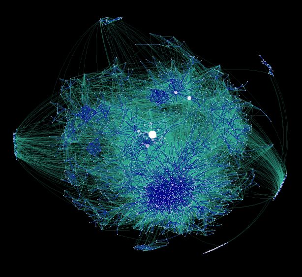
Data Mining has rendered an amazing depiction of the blogosphere by creating a graph displaying its interlinking structure. The graph also explains why political blogs are so hot, which we've observed in the top blog posts of 2006.
The densely interconnected area below the heart of the graph represents the socio-political blogging community. To find the technical bloggers, look above and to the right. See the difference? Tech bloggers are in their natural medium online, but it seems that they still act shy and introverted on the Net (at least based on their relatively diffuse link structure). Tags:
Tags:
The densely interconnected area below the heart of the graph represents the socio-political blogging community. To find the technical bloggers, look above and to the right. See the difference? Tech bloggers are in their natural medium online, but it seems that they still act shy and introverted on the Net (at least based on their relatively diffuse link structure).
 Tags:
Tags: Labels: Technology


