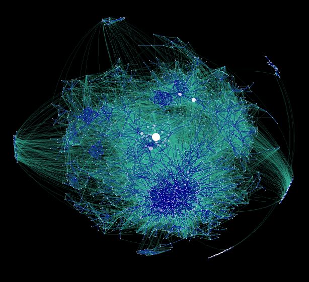
The densely interconnected area below the heart of the graph represents the socio-political blogging community. To find the technical bloggers, look above and to the right. See the difference? Tech bloggers are in their natural medium online, but it seems that they still act shy and introverted on the Net (at least based on their relatively diffuse link structure).
 Tags:
Tags:
No comments:
Post a Comment